There are moments in architectural rendering when less truly is more. Early in a project, a dense, fully dressed scene can bury the core idea under textures, entourage, and decorative lighting. A simple architectural render keeps attention on massing, proportion, and the relationship of volumes. In other words, it expresses architectural intent with clarity. At GENENSE, we see this in kickoff meetings, pre‑application reviews, and internal presentations where the team needs alignment, not gloss. A restrained approach supports conceptual design visualization while leaving space for discussion, iteration, and fast decision-making.
The principle is straightforward: control information density to protect meaning. A simple scheme reduces noise and heightens the signal, creating a strong visual hierarchy. When forms are expressed as white or clay volumes, the eye reads the architecture first, then the adjacencies, then circulation. In practice, that promotes alignment between architect, client, and consultant teams who are still defining priorities and testing options. The goal is not to avoid detail, but to apply the right level of detail at the right time.
What we mean by “simple” in architectural visualization
Simple does not mean generic. In our studio, simplicity is a tailored strategy that aligns visualization with the project’s stage of development. For schematic or feasibility work, the model is kept intentionally low in decoration and texture so that structural logic, spatial relationships, and façade rhythm remain legible. You might see white or clay massing, simplified glazing, and even sun studies without volumetric fog or complex vegetation. The intent is clarity and speed – understanding the architecture as a system before investing in photorealistic finishing.
This approach supports both internal design development and external client communication. It pairs well with quick alternatives, so stakeholders can review A/B options side by side without being swayed by furniture finishes or landscaping that are not yet chosen. It is particularly effective for plan‑to‑volume iterations, envelope studies, and density testing where the question is “Does this configuration work?” rather than “Does this marble match the brass?”
When a simpler style is the right choice
Projects often benefit from minimalism at specific milestones. We see this across residential infill, hospitality conversions, workplace fit‑outs, and healthcare planning.
Early decisions, faster cycles
In the first weeks of design, teams are still mapping constraints and opportunities. Early-stage architectural rendering is about surfacing the big issues fast: massing against rights‑of‑light, core placement, parking counts, or unit stacking. At this stage, schematic renders show form, light, and adjacency, not material catalogs. Fewer variables mean faster changes, so you can test multiple options in a day, not a week.
Stakeholder alignment before material choices
Before you lock into finishes, it is critical to maintain stakeholder alignment around structure, program, and circulation. This is rendering for client communication at its most practical. The client wants to validate the logic of the plan; the architect wants to test envelope performance; the contractor wants to see buildability. Simple imagery keeps everyone focused on the same questions. It also makes risk visible earlier – issues stand out when the scene is not overloaded.
Massing and compliance reviews
Municipal reviews frequently care about scale, overshadowing, and streetscape contribution more than finished interiors. In such contexts, clay or white‑box models give officials a clean read. That is when a simple architectural rendering is often enough to secure initial feedback, document compliance intent, or support a green light for further development. It can reduce back-and-forth while helping keep the submission succinct.
A decision framework for choosing the right level of detail
A useful way to decide between minimal and fully dressed imagery is to map visuals to decisions. Ask: what decision are we trying to make, who needs to make it, and what information do they need to see? When the required information is structural, spatial, or programmatic, simplicity wins. When the decision turns to finishes, mood, and brand, detail becomes essential. The key is choosing with intent, not by habit.
If the question is about form and massing, keep information density low and use white or clay renders.
If the question is about user experience or brand mood, increase detail selectively – one hero view can carry materiality without turning every angle into a marketing shot.
If the question involves approvals or planning, tailor the level of detail to the submission checklist and the reviewers’ expectations.
This tiered approach respects time and budget while maintaining design clarity. It also helps protect the team from designing by texture, reducing the risk of making decisions for the render rather than for the building. At GENENSE, our workflow explicitly stages deliverables so the team moves from schematic to detailed at the moment it adds real value, not earlier.
How “minimalist” looks in practice
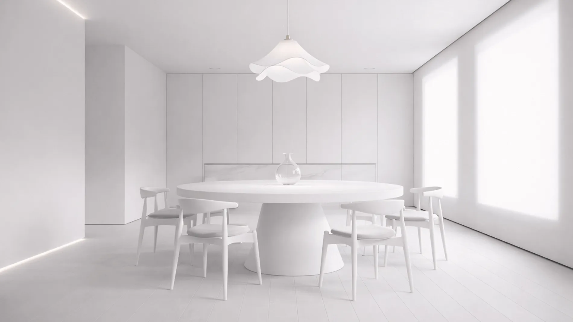
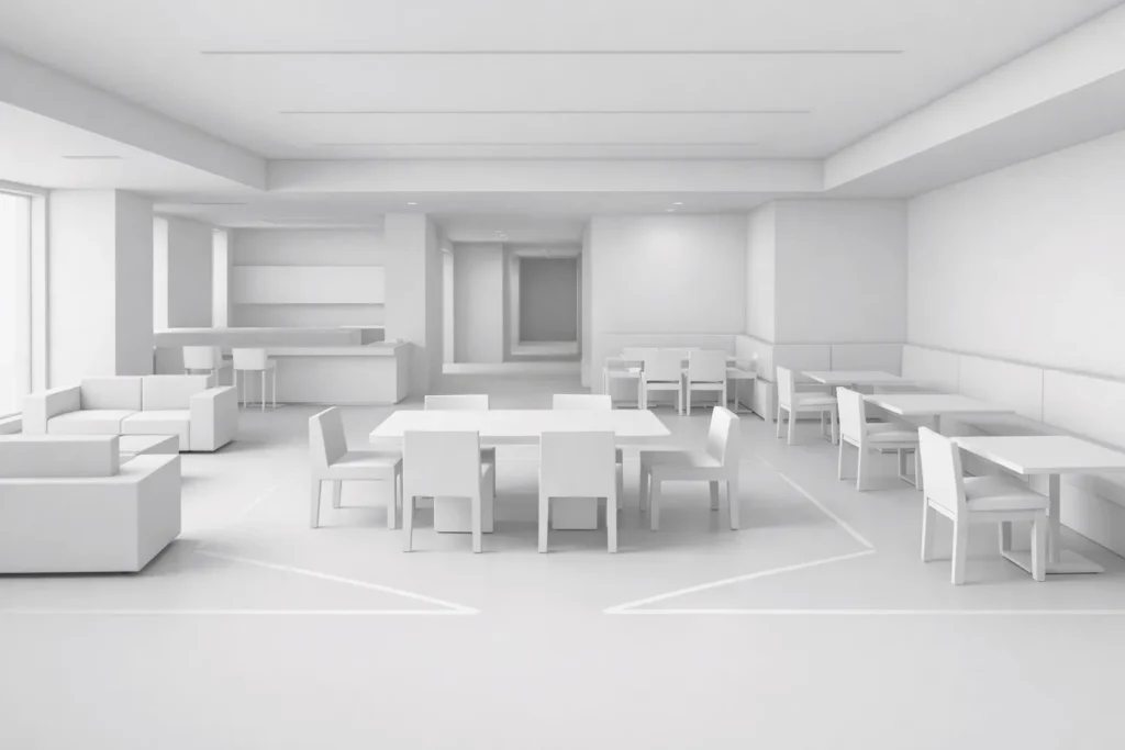
A minimal set is still a professional set. It is engineered for understanding rather than spectacle. Think white massing with soft global illumination, simplified reflections, and carefully controlled contrast that preserves legibility. Interior studies may use basic furniture blocks to check clearances and spatial hierarchy rather than bespoke pieces. Exterior views prioritize silhouette, façade cadence, and shadow play.
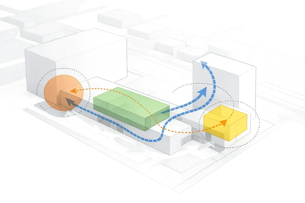
Crucially, minimal does not mean monotone thinking. We use controlled overlays – lines, arrows, or transparent layers – to communicate circulation or program densities without complex texturing. When needed, short captions can carry key numbers such as area, units, or parking counts, keeping the visuals uncluttered while delivering the information stakeholders require.
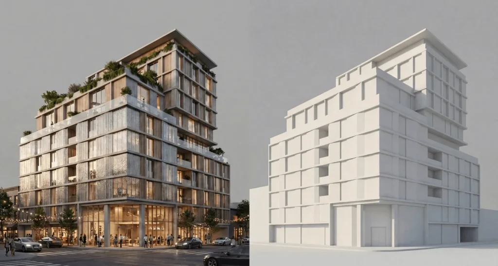
Simple vs detailed: a practical comparison
As projects progress, teams naturally pivot to more complex visuals. The trap is jumping too soon. A side‑by‑side of simple vs detailed architectural rendering makes the trade‑offs explicit.
Residential mid‑rise concept: Simple massing renders validate setbacks, terrace shadows, and window rhythm quickly. Detailed shots come later to communicate brick tones and metalwork for marketing purposes.
Hospitality lobby refit: A minimal interior render confirms circulation and desk position; a later photorealistic sequence sells lighting temperature, stone texture, and signage to ownership.
Workplace floorplate: Early images resolve workstation density and breakout adjacency; detailed renders validate brand finishes and acoustic treatments before procurement.
This sequencing reduces rework. The team does not remodel millwork three times to suit prematurely chosen materials. Instead, you move from structural clarity to finish‑grade realism when the design has matured, and approvals or marketing needs justify the investment.
Why this works: visual hierarchy and cognitive load
A simple image controls visual hierarchy by design. High‑contrast shapes and clean silhouettes enable the viewer to parse spatial relationships quickly. Reducing textures and patterns can lower cognitive load, helping stakeholders focus more on architecture than surface detail. For invention‑heavy projects, this safeguard is vital. It prevents feedback from drifting into personal taste about finishes when the structural idea is still forming. It also compresses meeting time – the group discusses the building, not the décor.
The corollary is that detailed, photorealistic renders are unbeatable when you need to evoke atmosphere, convey brand, and convert buyers. Both modes are essential. The craft is sequencing them intelligently so each meeting gets the right tool.
GENENSE’s approach to simplicity and speed
As an architectural visualization studio, GENENSE supports architecture and design teams from concept through marketing. Our process is built around architectural understanding rather than software tricks. We start with alignment: what decision is this image supporting, what level of detail is appropriate, and which stakeholders will review it? Then we recommend a custom set – massing, schematic scenes, or a minimal interior – and schedule short review loops for fast validation.
Because our studio manages both ends of the spectrum, moving from clay to photorealistic is seamless. Teams often begin with minimal exteriors or interiors, then escalate select views for investor decks or pre‑sales. Our professional architectural visualization services include 3D exterior and interior visualization, furniture and product rendering, architectural animation, and 3D virtual tours alongside tools like architectural photomontage and home staging. That breadth lets us tailor deliverables to the exact decision you are making.
Typical “simple” deliverables we provide
White‑model massing views with sun and shadow for multiple times of day, plus optional line overlays for setbacks and heights.
Schematic interior vignettes using low‑detail furniture blocks to test spatial intent, adjacencies, and circulation while maintaining clarity.
These sets are intentionally light, which boosts efficiency. They render fast, iterate faster, and keep budgets aligned with the current stage. When the project is ready, we upgrade the same model into photorealistic hero shots and animated sequences for marketing presentations without breaking the workflow.
When to move beyond minimalism
As soon as the design questions become material‑driven – reflectance, translucency, texture scale, or branded color – it is time to raise the level of detail. Retail façades, hospitality lighting, and residential kitchens all benefit from photorealistic simulations of material behavior. We often add a single detailed hero view into an otherwise minimal set to answer a targeted question while keeping the rest of the package nimble for ongoing development.
How do we keep minimal images persuasive?
A minimal render still needs to feel resolved. We calibrate camera height and focal length to match professional photography, maintain consistent horizon and vertical alignment, and balance contrast so edges read crisply without clipping highlights. Light is treated as part of the design – soft sky for massing, directional sun for articulation, and subdued interiors for schematic clarity. These choices keep the image authoritative even with low surface detail.
We also design the sequence of views as a coherent narrative. A sitewide massing establishes context; a closer elevation studies rhythm and scale; an interior vignette confirms circulation. Together, they tell a complete story without overburdening the viewer. This structure works equally well for internal workshops and formal presentations.
Mapping simplicity to cost and schedule
A minimal package typically reduces modeling and look‑development time, which shortens schedules and keeps fees proportional to the project’s stage. In our experience, early schematic sets can often be delivered in days rather than weeks, depending on scope and inputs. That efficiency is not about cutting corners – it is about aligning visualization with the decision at hand. By staging complexity, the team preserves resources for the critical moments when photorealism will make or break a pitch.
Ensuring design integrity from concept to marketing
Simplicity early does not compromise the final product. Because we build a clean, organized model upfront, upgrading to materials, lighting, and entourage is straightforward. This staged workflow protects design intent: the geometry that was validated in simple renders becomes the backbone of later, detailed imagery. The result is consistency across every phase – internal workshops, planning submissions, investor decks, and public‑facing marketing.
Integrating simplicity with broader project services
Simple imagery sits within a wider set of services. As projects mature, GENENSE can extend the deliverable suite with detailed interiors, exterior hero shots, motion pieces, and interactive tours. If approvals require contextual accuracy, we add architectural photomontage to anchor the scheme in verified photography. For product manufacturers, we start with neutral lighting for form validation before transitioning to lifestyle scenes. Each step is tailored to maintain clarity while meeting the requirements of each stakeholder group.
Bringing it back to your project
Simplicity is not a fallback – it is a strategic choice that respects stage, audience, and the decisions at hand. If you are shaping massing, validating spatial logic, or aligning a diverse stakeholder group, a minimal set can move your project forward faster and with less noise. When you are ready to sell the vision, we scale the same model into polished, photorealistic assets for marketing. If you want to explore a tailored package for your next feasibility, schematic review, or investor deck, our team can recommend the right balance of minimal and detailed deliverables and schedule a quick start.
Explore how GENENSE can support your team from concept to campaign with custom, stage‑appropriate visualization – schedule a call or request a quote to start the conversation.
FAQ
Start with the purpose of the presentation and the decisions you need from the room. If the group must agree on spatial organization, massing, or broad planning issues, a minimal set will focus attention on architecture rather than finishes. Once the conversation turns to materials, atmosphere, and brand, photorealistic images become the right tool.
Yes, when it is framed correctly. Explain that the intent is to evaluate core design moves before committing to materials. A clean, well‑lit clay or white model communicates confidence and makes it easier for clients to comment on the big picture. You can include one detailed hero view if the audience needs a taste of finish quality without shifting the entire package to marketing grade.
Minimal imagery typically shortens cycles and lowers costs at the outset because modeling and look‑development tasks are lean. It also reduces rework by avoiding premature material decisions. The investment shifts toward the phases where photorealism directly supports approvals, sales, or public presentations, which keeps resources aligned with value.
That is the idea. A clean schematic model becomes the foundation for detailed renders. We transition to materials, lighting, and entourage on the same geometry, preserving earlier validations and keeping alignment across teams. This staged evolution protects design intent and helps maintain momentum from concept through marketing.
Commonly, you will see white or clay massing for exteriors, schematic interior vignettes for circulation decisions, and a few targeted angles that explain program and scale. Each view is composed to read clearly in presentations and reports, with consistent cameras and an understated color palette that maintains focus on architectural form.
Rate article:
Nice
Average rating: 5 / 5
Vote count: 1
Denys Borozenets
CEO at GENENSE
Denys is the CEO of GENENSE Studio. His mission is to build an international community of passionate CGI professionals, where everyone can unlock their potential by creating high-end digital content that helps highlight any product on the global stage.
As a leader, he holds himself to the highest standard of responsibility - for both his own work and that of his team. For the members of GENENSE, responsiveness and open communication are the core values that drive their collective success.
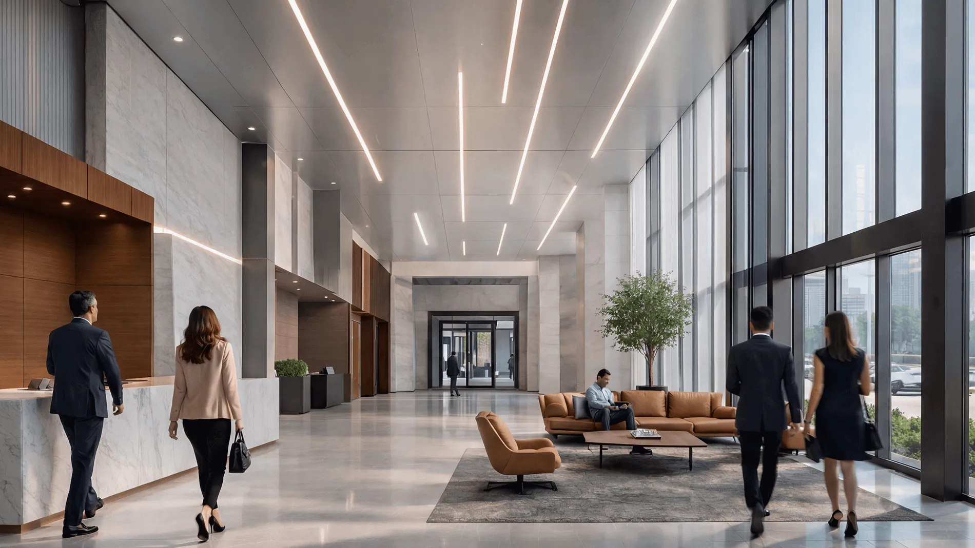
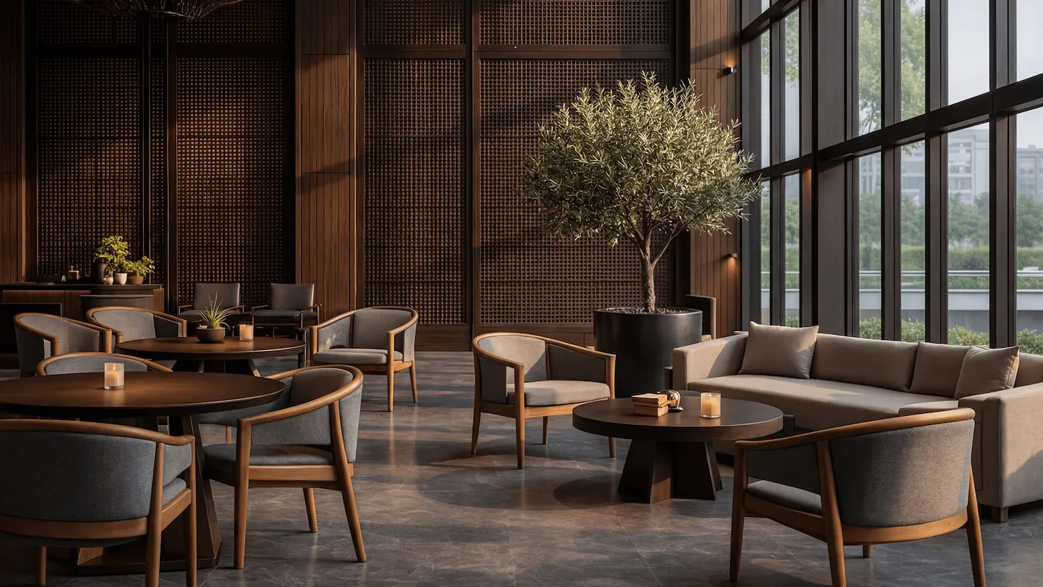
Why corporate headquarters need visualization that goes beyond “nice pictures.” Corporate headquarters are not just workplaces – they are strategic assets. Executive floors host investor briefings, R&D labs sit next to agile neighborhoods, and client areas must perform as brand touchpoints while meeting stringent acoustic, security, and wellness criteria. In this setting, office interior rendering […]
Why visualization makes or breaks a sports pitch Securing buy‑in for an arena, training complex, or campus rec upgrade demands more than attractive images. Decision‑makers need to understand how a building will move crowds, manage light and sound, and deliver revenue across game day and non‑event operations. This is where rigorous visualization turns vision into […]
Every restaurant negotiates the same tension: more seats increase potential revenue per square foot, yet higher density can erode guest comfort and lengthen service times. In practice, the right equilibrium is shaped by concept, local code, and operational choreography. Dining rooms compete with circulation, queuing, accessibility-code clearances (e.g., ADA in the U.S.), acoustic treatments, host […]
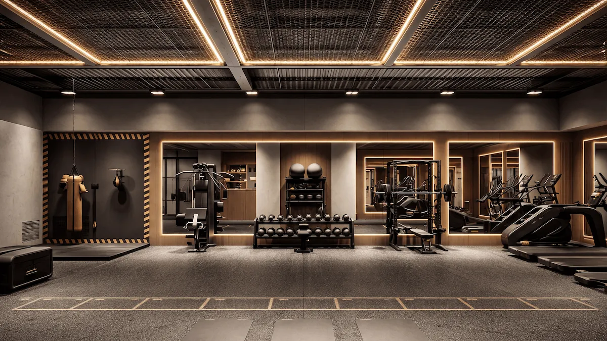
In fitness projects, the most expensive mistakes rarely come from finishes. They come from moving heavy equipment after construction has started, rebalancing HVAC because the cardio area runs hot, or discovering that barbell clearances clash with a column line. High‑stakes issues often hide in plain sight on plan views. Photoreal visualization brings those decisions forward, […]
Why lighting is the difference between images that inform and images that sell On any design project, light is the medium that reveals form, color, and texture – and the variable that most directly shapes client perception. At GENENSE, we treat illumination as a controlled experiment rather than a cosmetic tweak. Remember that lighting strongly […]
The success of real estate sales is strongly influenced by how a building is presented to potential buyers. 3D walkthrough animation and architectural flythrough are effective tools for remotely showcasing the advantages of a house. New development projects emerge daily, and both the primary and secondary markets are filled with new offers. Through high-quality architectural […]